18 Colours Mixed

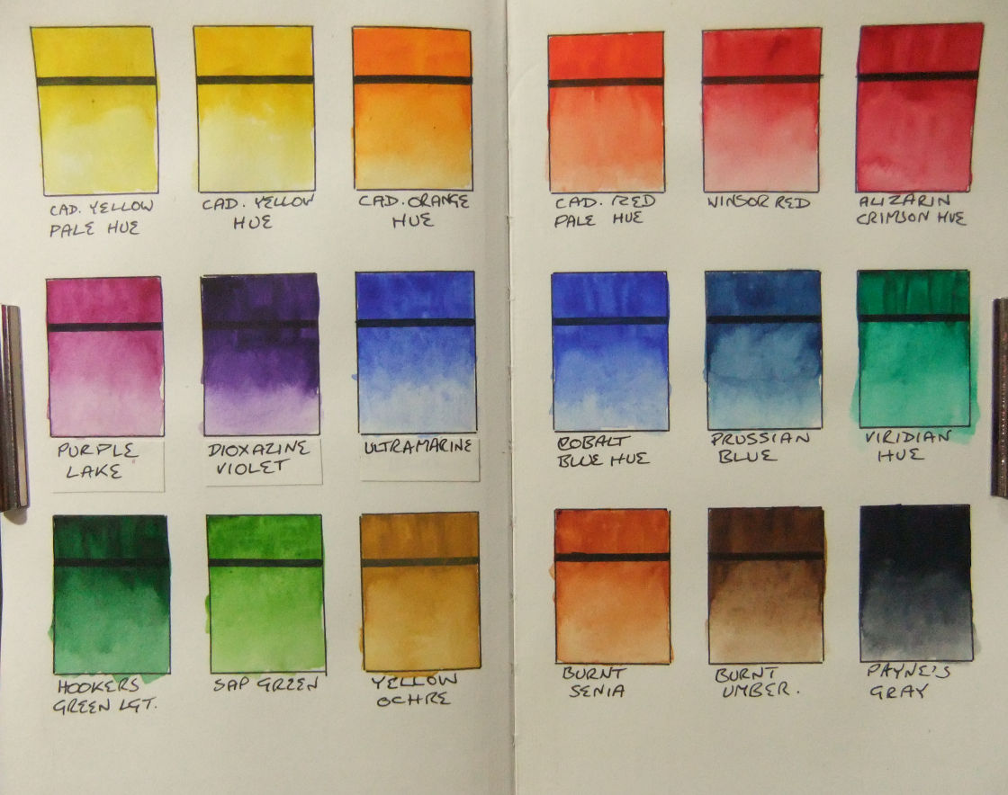
As i use the University of Youtube to teach me all about watercolours, it appears that artists eagerly produce mix charts for every palette they use. So, not to be outdone, i proceeded to do just this with my one single palette.

By doing this one can learn many things: it’s not just about the colours, but also the relative strengths of the pigments within each colour.   And i do admit that it was also a rather enjoyable pleasure watching the colours change as i mixed them.

My palette consists of 17 Winsor & Newton Cotman colours, and one Winsor & Newton Professional colour — that being the Winsor Red.

It struck me as i was mixing them the difference in quality between the Winsor Red and the Cotman colours.   When mixing with the Winsor Red i only had to apply a tiny amount compared to the Cotman colour i was mixing it with, else the Winsor Red would simply over power the other colour.   So a good lesson learned there as to the difference between student grade and artist grade watercolours.   I look forward to slowly swapping out the Cotmans for artist grade ones as time goes by.

Certainly the first colour i want rid of is the Sap Green.   This colour, i felt, just totally lacked any mojo and was easily drowned out by other colours.   It doesn’t look too bad on the mix chart, but to get those colours with it i had to use over twice as much paint as the other colours.   So whether i want rid of it or not, it isn’t going to last very long anyway.   Therefore, i shall return to the University of Youtube and find me a suitable replacement to try.

For anyone interested, i used a sheet of Fabriano Artistico trad white for this.

So my next step in my watercolour journey is to simply play around to find the colours i need and learn to apply them nicely in order to paint my recent picture of De Waag.

Ta ta for now.   x

#5t4n5 #art #painting

De Waag — Amsterdam

De Waag -- AmsterdamMaterials:   Handbook Drawing Journal 8.25×5.5in and a Uni Ball 0.1mm Pin.

Thoughts:   While wandering through Teoh Yi Chie’s channel on Youtube i found “Sketching the Waag at Nieuwmarkt square (timelapse tutorial)”.

I really liked the look of the building and had a look at Teoh’s reference photo.   It was quite a small photo and the building was obscured by a fruit & veg market and lots and lots of cars and vans, so i went off to Wikipedia and found this one.

Learned:   Find a picture of the subject that i really like and with tons of pixels to exploit: 3872 x 2592.   Don’t worry if you make a mistake, which i did several times for any amateur art critics out there who want to practice being picky as fuck while i practice my urban sketching.   While i quite enjoyed drawing with the Uni Ball Pin, i don’t think the 0.1mm is 0.1mm, it’s not even close: i can get finer lines with my 0.5mm Rotring Tikky pencil.

Soooo:   I do need to pay a bit more attention to what i’m doing as i did make some silly mistakes, but for a first go at sketching a building i’m rather happy with it.   I also need to find a better pen for the really fine stuff.   This pen will write quite fine but you have to be really delicate with it to do so, as soon as you allow any pressure at all it starts to get quite thick.

Next:   I have to do a nice mixing chart with my paints, which should give me a little more practice with them.   And then i get to cover my nice picture of De Waag in lots of pretty colours and you’ll all get to see how it turns out.

I’ll be back soon, so don’t go away.   Well, alright then, you can go away, but make sure you come back soon and i’ll see you here.

#5t4n5 #art #drawing #urbansketch #waag

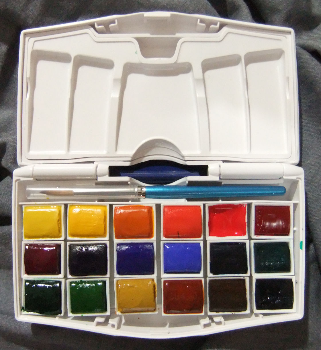
Cotman Water Colours Pocket Plus

As i’ve been exploring my new art journey — wondering around Youtube — i’ve come across the art of ink and wash style urban sketching.   I’m very attracted to it and want to give it a go and see where it takes me.

So i thought i’d buy the bits i don’t have — like the paint.

And whilst perusing ebay i came across the “Cotman Water Colours Pocket Plus” palette. ink and wash Someone was selling them, brand new, for less than £10 including postage: so yeah, i bought one.

When it arrived i had a good look at it and decided that with a bit of coaxing from my Dremel i could turn a 12 half pan palette into an 18 half pan palette.

So, having thrown out the “Chinese White”, as i bought a tube of white gouache instead, i was left with space for another 7 colours.

Which i promptly ordered.

I then hacked out the needless bits that were in the way, cut a piece of sturdy plastic to snugly fit the bottom with and stuck the half pans to that with Pritt sticky dot things.   This allows me to lift all the pans out if i need to and to also remove them individually as well.

All six additional half pans i added were Cotman, and the empty “Chinese White” half pan i filled with “Winsor Red” from “Winsor and Newton’s Professional Water Colour” range.

I then proceeded to make a swatch of all my new colours in my new Handbook sketch book.

I’ve never been very good with paints, but i’m quite happy with how this turned out for a first time ever go with proper water colours.   I don’t think a 6mm flat brush was the best choice, but it got the job done good enough for me.

As a place to start from i’m very happy with my 18 colours and i’m looking forward to playing with them a lot this year, especially when the weather gets nice and i can get outside and play.

I’m thinking of buying a colouring book and just playing with the paints in it.   Seems like a good idea to get some much needed painting practice in.

#5t4n5 #art #painting

Arghhhh!!!

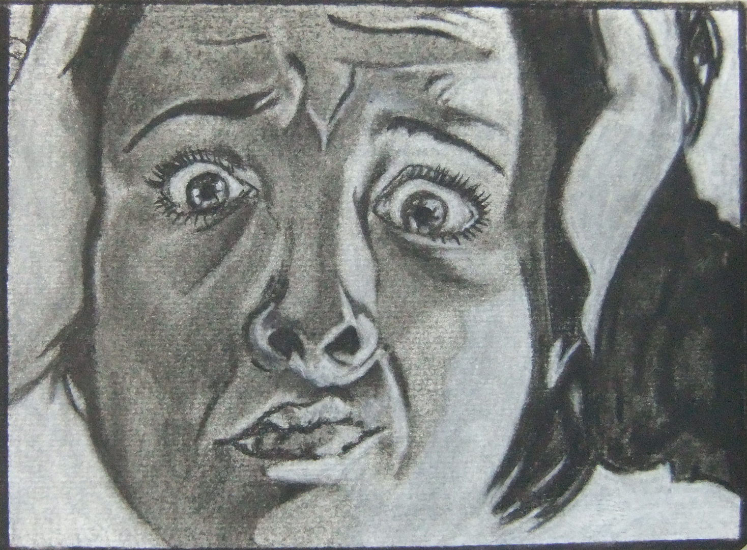
I found some lessons on Conté à Paris’ website and decided to have a play.

Materials:   Conté à Paris Black B crayon, Pierre Noire H and Blanc 630 on Pink Pig Sketch Book 150gsm white mixed media cartridge.

Thoughts:   The “Subtractive Drawing” lesson says to use a black pastel pencil to make the paper grey, i didn’t have one so i used the Black B crayon instead.   Need to try this same technique with a black or grey pastel instead and see what the difference is like.

I used the picture from the “Expressive Self Portrait” lesson, which some may think is defeating the object, but my mission wasn’t to do the self portrait lesson, it was to find a challenge that i could apply the subtractive drawing method to and i liked that picture.

Learned:   That i can do a reasonable copy of something.   How to use different erasers for drawing light in.

And:   I definitely plan no coming back to this technique in the future and have some more playtime with it.   It’s a fun way to draw.

In the meanwhile i have another picture on the go which i need to get finished.

#5t4n5 #art #pastels #painting

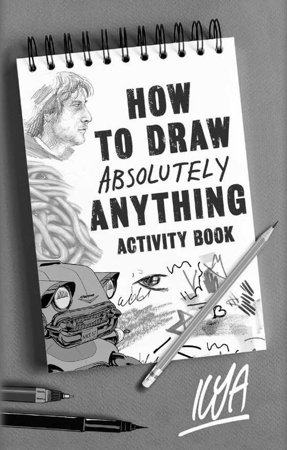
How to Draw Absolutely Anything Activity Book — ILYA

How to Draw Absolutely Anything Activity Book -- ILYANot anything like i was expecting.

I bought this because i’ve just gotten back into drawing after nearly 30 years of not doing any and i thought it might help a little.   I was expecting a book about how to draw, literally, but this isn’t really about that.

This book is more about working on your expectations and why you draw in the first place.   It’s more about drawing as just something you should do and what it should mean when it becomes as normal to living as eating and drinking.   What’s the point in drawing if you don’t know why you’re drawing?

What are you drawing for?   What do you really want to draw and why?

These are a few questions that the book made think about without directly asking them.

So don’t expect a book that tells you how to hold your pencil properly or what lead you should use on what paper, expect a book about your expectations and then go and draw something, anything, it doesn’t matter, just draw.

To sum this book up nicely would be this quote from the last few pages:

DON’T SAY “I can’t draw” especially when what you mean is, “I don’t draw.” DON’T SAY that either.

ILYA’s Page

#art #ilya

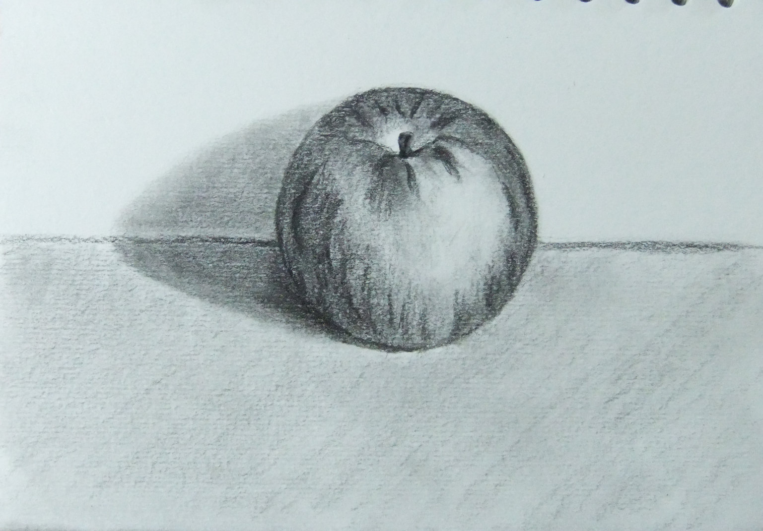
Apple

Materials:   Koh i Noor Giaconda Silky Black 2 on Pink Pig Sketch Book 150gsm white mixed media cartridge.

Thoughts:   first drawing using my Cretacolor Ecologic — and also this lead.   Reminds me of being a child again with a big chunky crayon, especially as the Silky Black 2 has a nice waxy feel — and smell — to it.   Fun!

I bought this sketch book years ago with all the good intentions of the world to get back into drawing back then, but alas, life went extremely off the rails for a while and it’s only now that i sit down with it and finally use it.

Learned:   Chunky lead holders are super fun.   You can get very good points and super black lines from these crayon type leads.   I’ve no idea what exactly they’re made of but they’re definitely fun to play with.

#5t4n5 #art #drawing

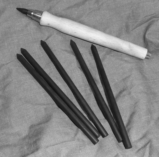
Cretacolor Ecologic Lead Holder

My latest acquisition for my drawing.

Lead-holders/clutch-pencils/mechanical-pencils come in all kinds of various materials, widths, lead sizes, lengths, weights, shapes, etc., and to be quite honest it’s all quite overwhelming to a drawing newbie and i really didn’t know where to begin or what i was supposed to be buying.   So, for a starting place, i just decided to buy whatever i liked the look of and when i saw this Cretacolor Ecologic wooden lead-holder, my mind was made up for me.   And i’m not disappointed.   It feels delightful in the hand, like a comfortable chunky crayon used to feel when i was a child.   I really, really like it.

There’s quite a few different leads to buy and try for this size of lead holder made by different companies and i plan to give them all a go eventually. It’s very easy to swap the lead out whenever you want to change so you can manage quite well with just one lead holder while you try out a variety of leads. So current plan is to find what leads i like and eventually buy one of these holders each for all my favourite leads.

The wood is unsealed and also has a nice fit-in-the-hand shape so it doesn’t take any effort at all to keep a good grip and control over it.   There’s an organic-ness to it.   I’m also looking forward to the plain wood taking on a good collection of smudges, marks and paw-prints over the years and developing a nice wabi-sabi aesthetic/patina.

Fun, fun, fun!!!

#5t4n5 #art #drawing

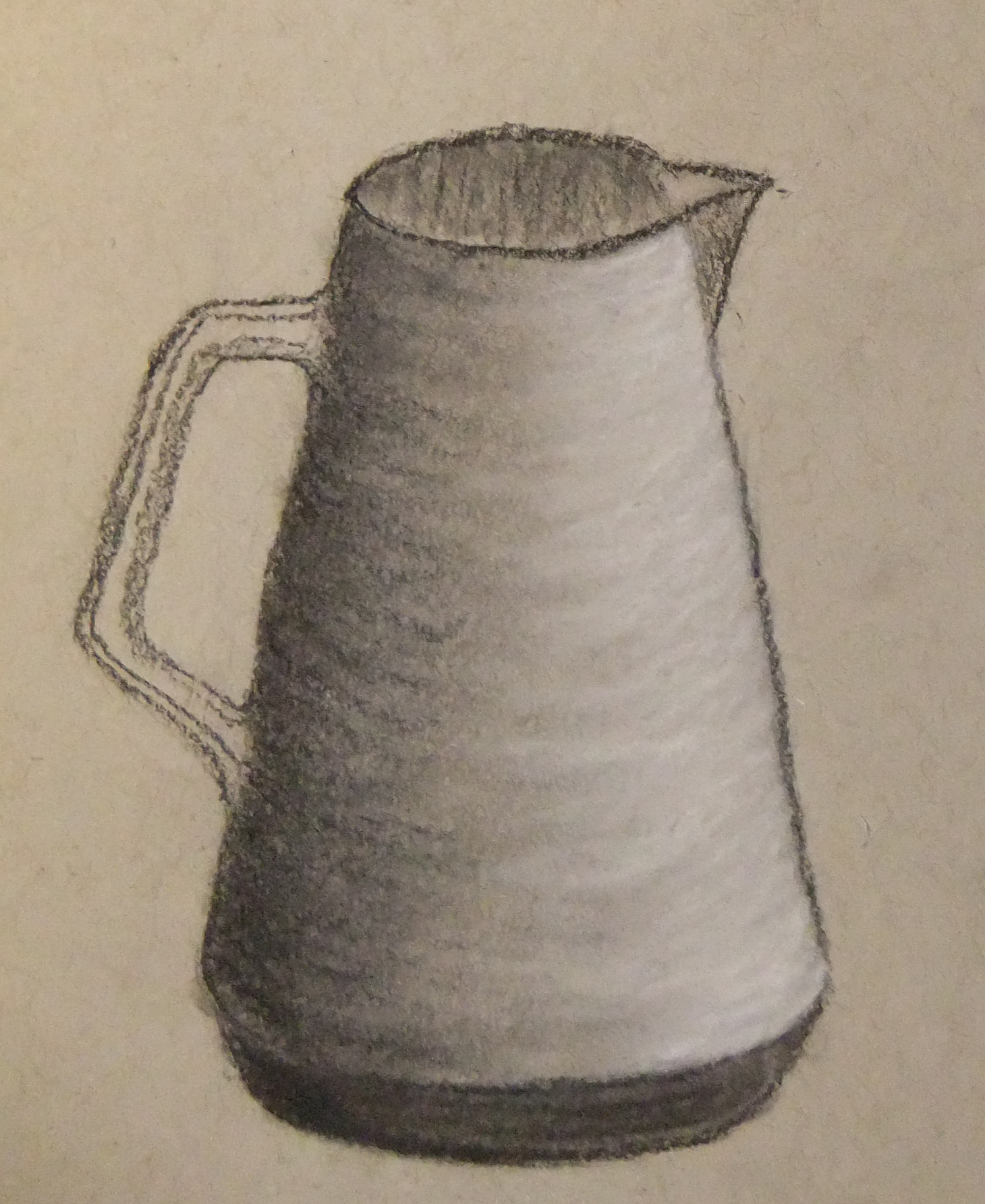
Jug

Materials:   Conté black ‘B’ crayon and blanc 630 pencil.   Paper is Strathmore Toned Gray — yes, i know, i’m off to buy a new light bulb when the shop opens today.

Thoughts:   first time playing with Conté crayon, ever, and i really like it.   Going to buy lots of them and see what may happen.

Learned:   Conté crayon is super fun.   I remember as a child really enjoying playing with crayons, so imagine my surprise and joy when i recently discovered that Conté make crayons for grown ups.   Awesome!

#5t4n5 #art #drawing

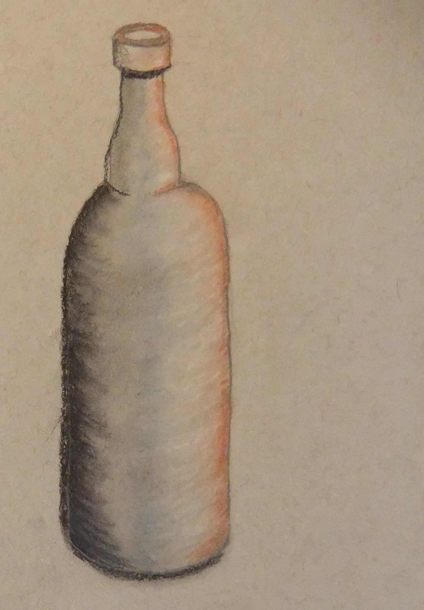
Bottle

Materials:   Started with a Derwent Graphic for initial sketch then played around with Conté; Pierre Noire 2B, blanc 630, sanguine, and pastel blue.   Paper is Strathmore Toned Gray.

Thoughts:   i need to sort my light bulb out as the paper is the Toned Gray and looks like Toned Tan in the photo.   Also not sure how i feel about the rough edges from the paper with the Pierre Noire, but i do love the depth of the black in this pencil — Johnny Nice Painter would love ’em.

Learned:   Pierre Noire didn’t sit on the graphite under-drawing, so in future i’ll try a harder Pierre Noir to do the initial sketch and see how that goes.

#5t4n5 #art #drawing